aarp average americans
Client:
AARP
Product:
Website Design
My Role:
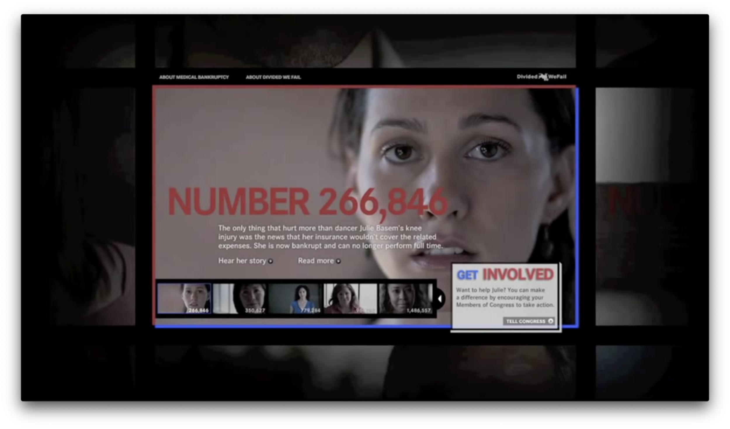
This was one of the first full websites designs I did with the team at Primal Stare, working as an Interactive Art Director. I was responsible for the visual design of video tiles and carousel motion, as well as complimentary digital campaign pieces. Although there were less than 20 videos, we needed to use some design tricks to make it appear as if there were thousands.
Problem:
AARP launched a campaign to raise awareness about medical bankruptcy and needed a website that highlighted individual stories and had a custom form used to contact members of Congress. We knew there were 10-12 stories that were filmed, and that it was possible they might film more, so scalability was a priority for this project. We also knew that these were just a few of hundreds of thousands of similar stories, so it was important to have a design that looked massive.
Audience:
This campaign aimed to educate as many people as possible about medical bankruptcy and there were both additional digital tactics and broadcast spots that ran all over the U.S. The goal was simply raising awareness and hopefully convincing people to contact Congress to affect some changes in policy, since a large number of people were finding out that their medical coverage wasn’t enough. As you can see from the stories shown, they were really filmed in a way that could draw sympathy from anyone that watched.
The Solution:
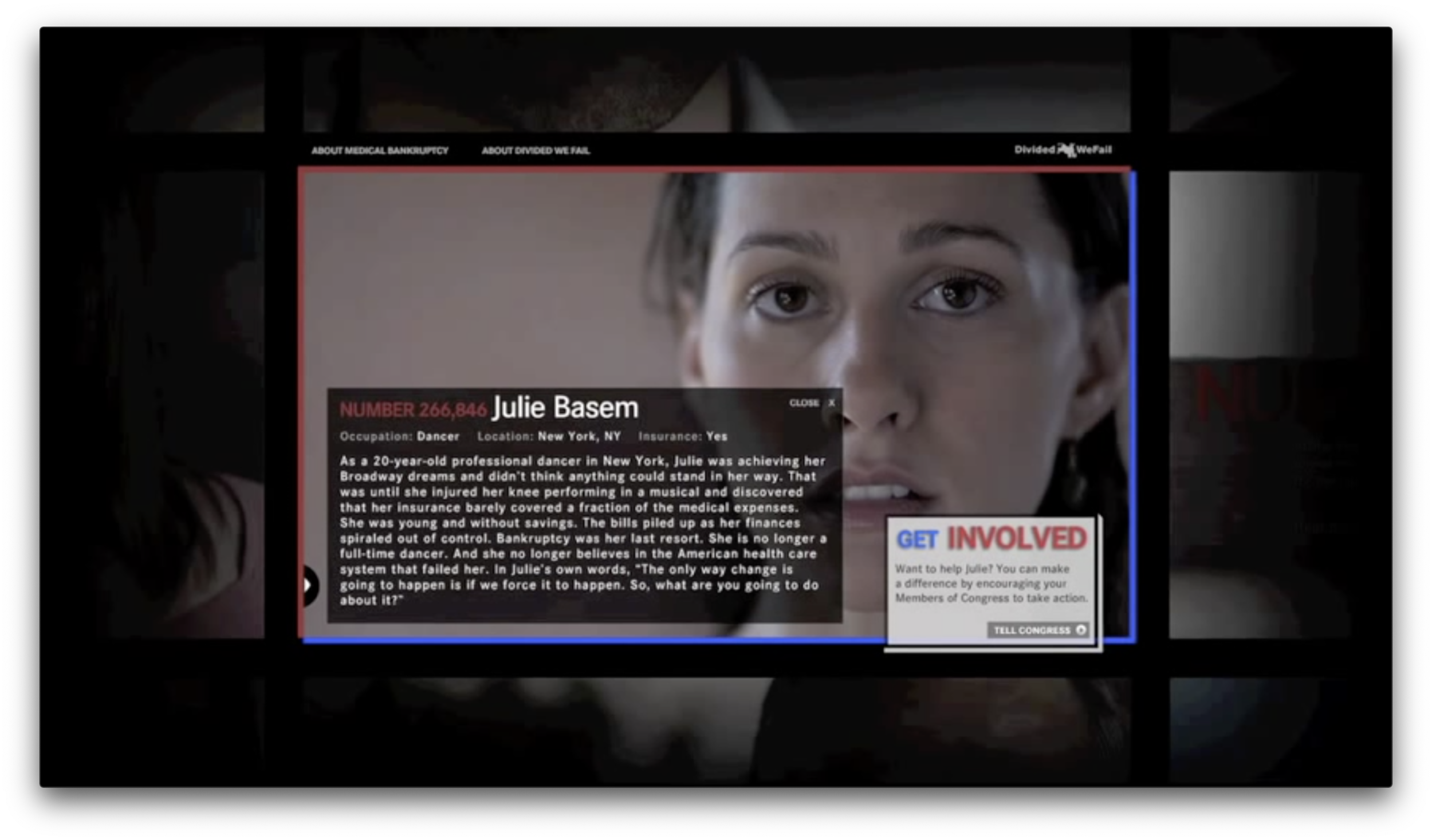
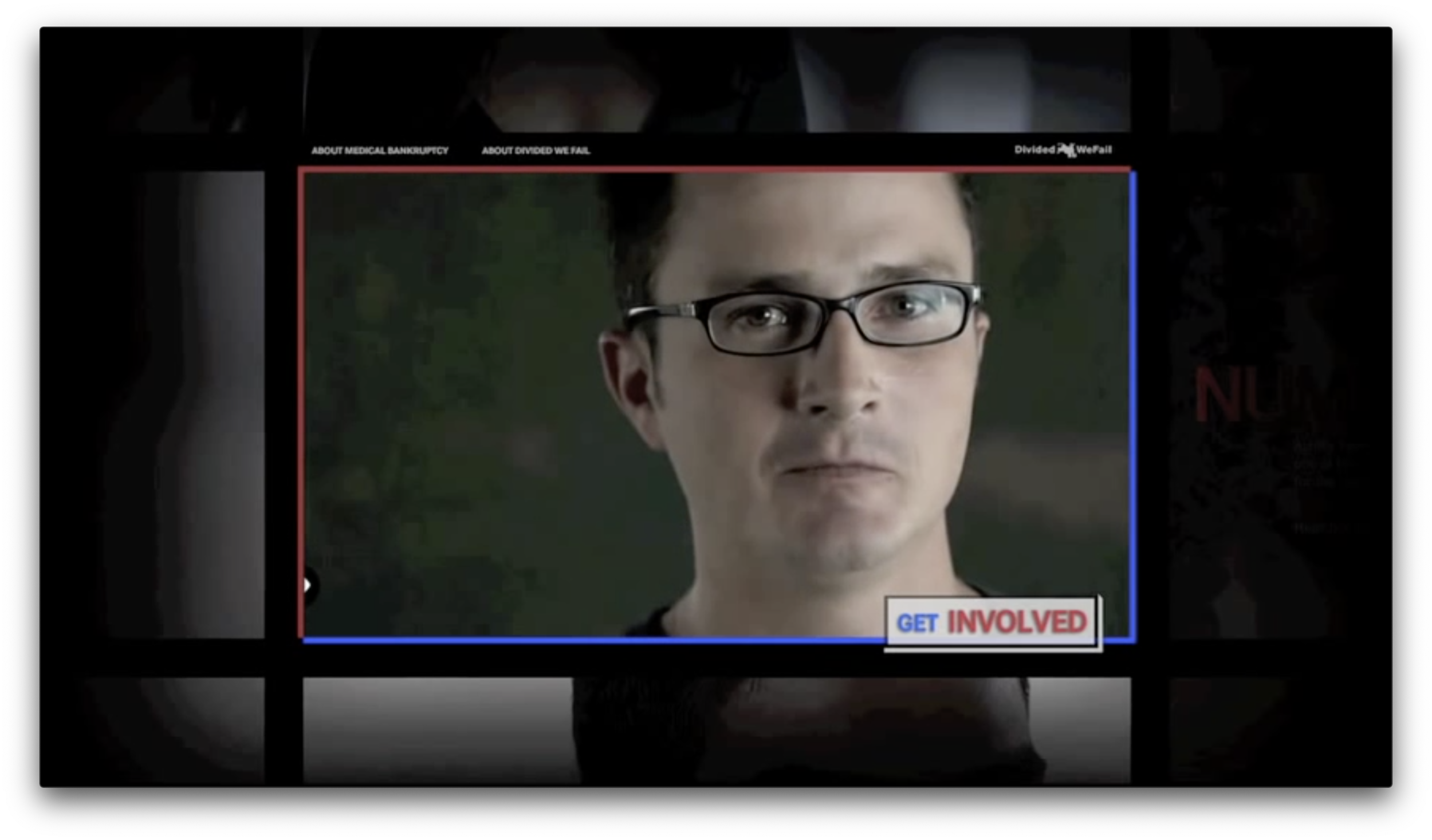
A fully scalable site design that was first based on one tile and expanded to fit as many stories as necessary. We decided early on that the grid would work really well for this because we could simulate scrolling through hundreds of stories while only showing 10-12 videos. Initially, we laid out the grid with each story that we had, knowing that the final tile in the bottom right corner would be our form, and then developed one animation style to use for each tile reveal. The rest was a matter of creating a few different arrays for the videos themselves, the static frames, the text versions, and for a final touch, the randomized numbers for each. After that, we added some counting animation and additional tiles around the edges of the grid to drive home the idea that there were thousands of people that were impacted.
Project Details:
Click or tap an image to read additional details.
Outcome:
I don’t recall if we ever really saw data on how many times the form was submitted or anything like that. That would have been great to know for sure, but shortly after this launched, we were thrust directly into some other huge projects. Our clients were happy with the site though, and it was certainly a little different than a typical site. I think the motion between tiles was really something fresh and new for the time, and it had a really simple look that made the people telling their stories the focus.
Lessons Learned:
I remember being amazed at the end of this because it seemed like we were able to work through this one so fast, but it was my first time really understanding how code and design worked together and how powerful that relationship is. Once I saw it in action, I was thinking about how we could have really had any number of videos or easily added more down the line. Once that structure was established, each tile really just boiled down to a static image, number, text layout and video, and because these layouts were the same, they could be added very quickly.


