
Bydureon Website Redesign
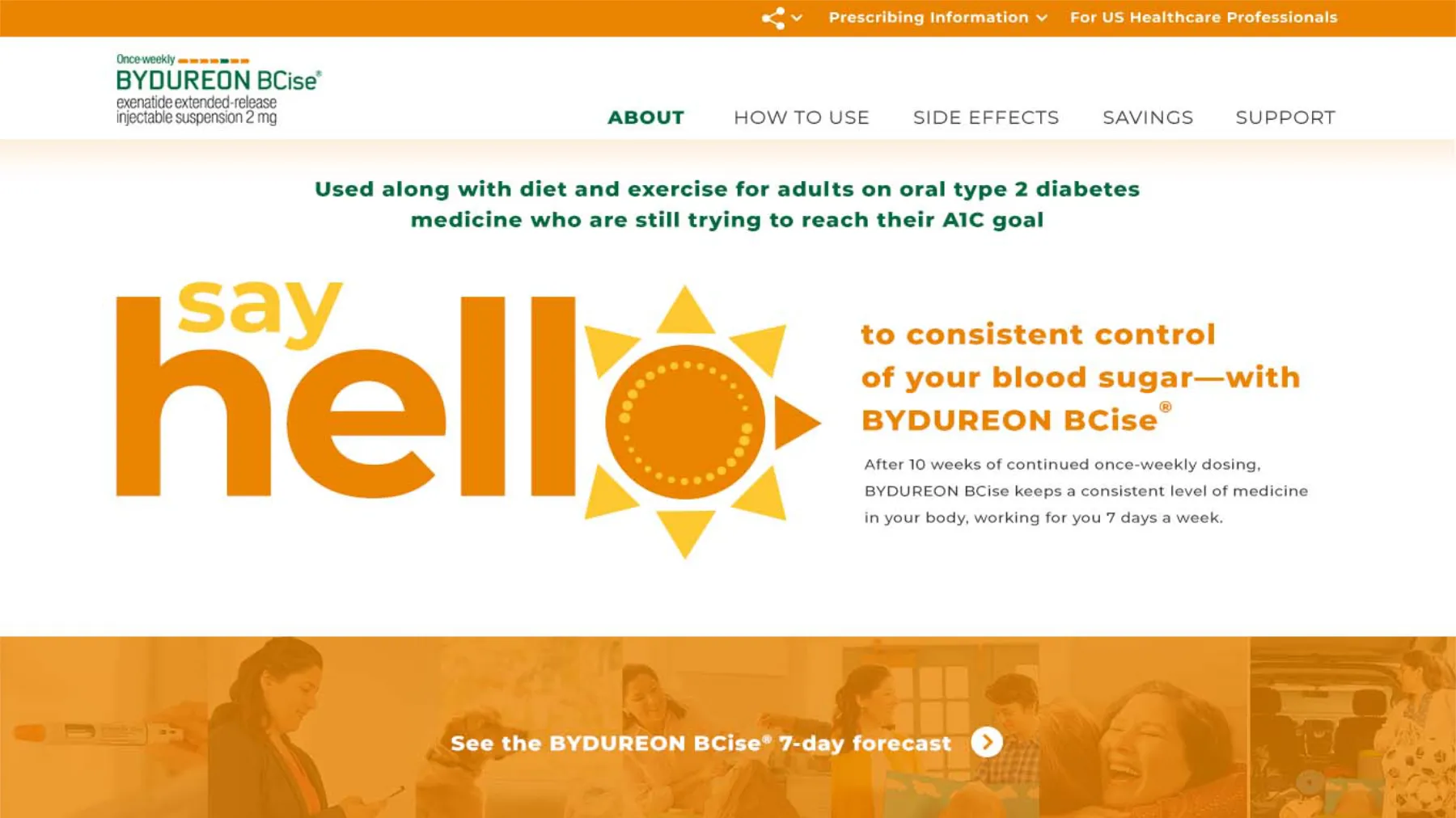
A full redesign of the Bydureon consumer site, built from content modules to feel warmer and scale across AstraZeneca brands. Video, quizzes, FAQs and copay registration became reusable pieces.

My role
I was the Senior Art Director for the project and was heavily involved in both preliminary concept generation, lead interaction design, and visual layout for the modular content and experience states. Components included a video player, interactive quiz, FAQ's, and patient registration form.
The problem
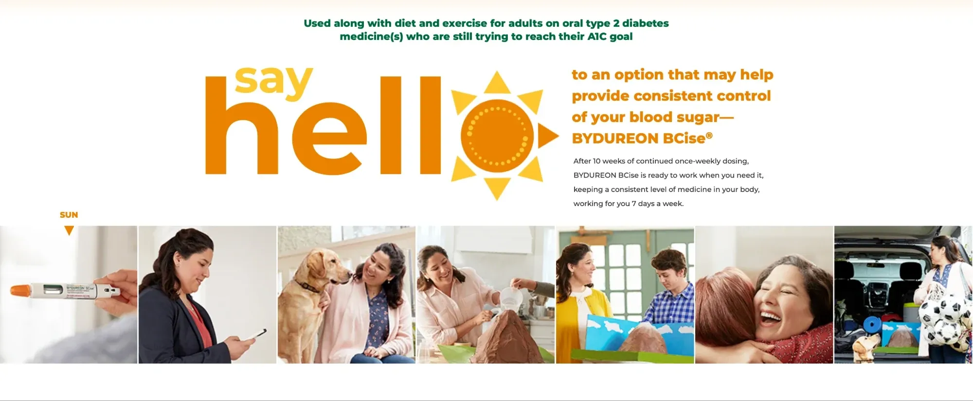
The Bydureon team needed to redesign the consumer website for patients with type 2 diabetes. They had recently filmed new TV commercial, and wanted their web presence to align with the new messaging. The overall feeling was that the old site was too cold and clinical.
The solution
Based on the new videos, we knew that this brand should take on a more friendly tone both from a visual and copy standpoint. We were able to start from scratch making mood boards, refreshing the color palette, typography, and hierarchy of information for the patients. Using a component-based design system was required, as scalability across AZ brands and specific media targeting and metrics were things the clients specifically called out in the design brief.
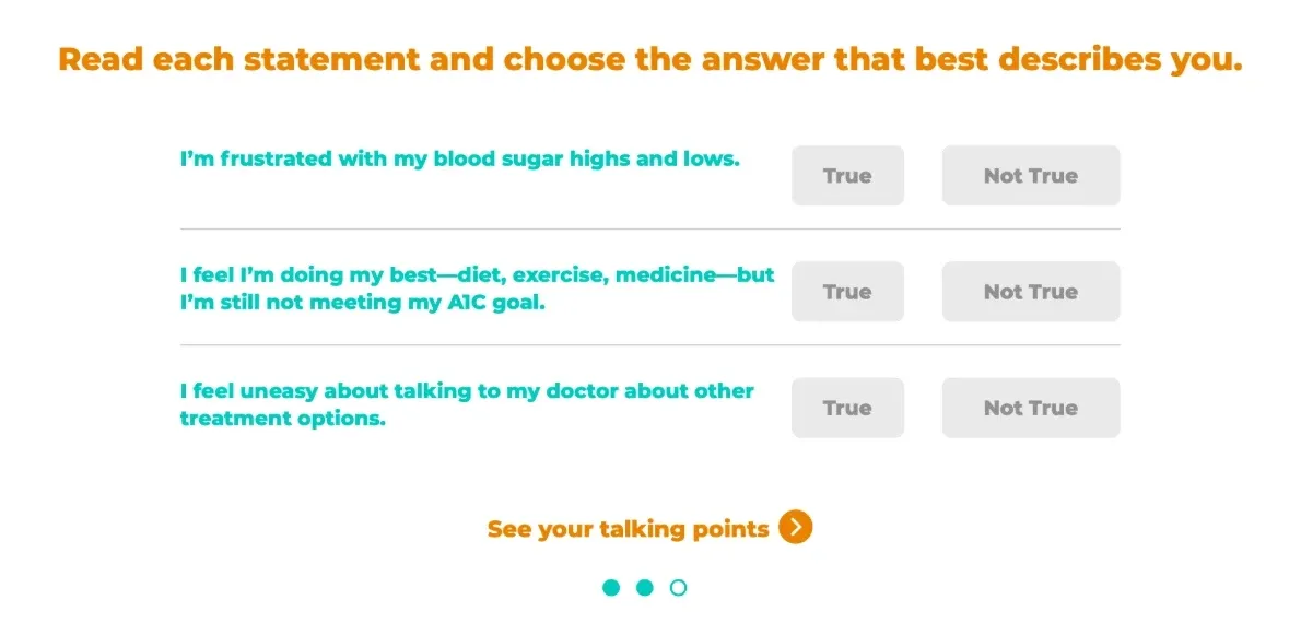
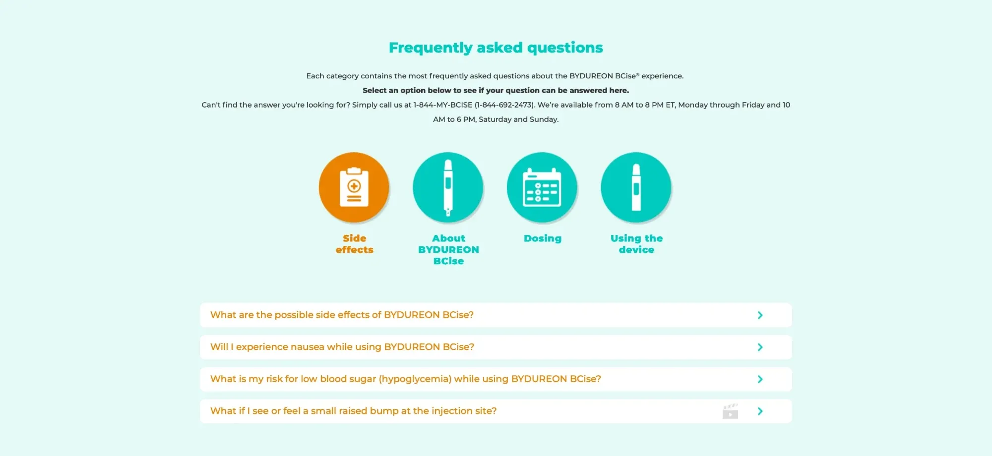
The modular build allowed my team and I to make important adjustments to the organization of content across multiple pages and streamline the user experience. Specifically, I wanted to use animation to emphasize high-value actions without disrupting the user's scroll down the page. For example, I built interactive quiz and FAQ modules for multiple pages, which helped users based on the context of each page rather than something at the bottom that encompassed all the information on the entire site. Our goal was to meet the patient wherever the were at, at that time in the journey.
At a glance
- Modular components scalable content blocks
- Interactive quiz for doctor visit talking points
- Contextual FAQ for help during all phases of the journey
The impact
This site launched in early fall 2019 and was a big success, according to our clients. Because AZ has their own internal Dev teams, we knew that applying this structure and some solid UX principles would scale really well and will lead to shifts in content organization for multiple brands in the future, which will allow people to find the information they need faster. Unfortunately, this drug was later discontinued and the site is no longer live. As was the case with some previous projects, we were not always made aware of performance data after handing off designs.
Project features
-
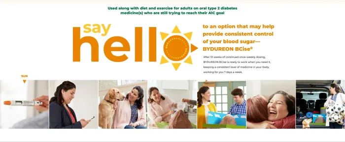
A modular, friendly experience -
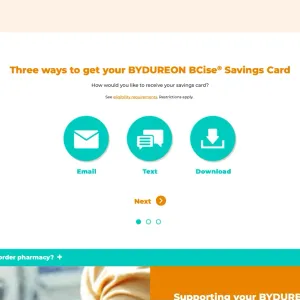
Savings registration -
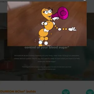
Video module -
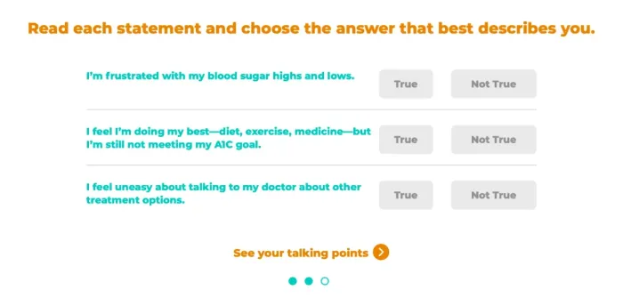
Interactive quiz module -
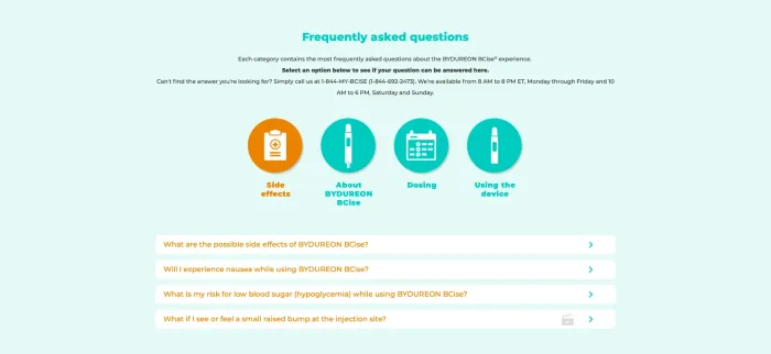
Adaptive FAQ
Lessons learned
Prior to this, every other site build I'd been involved with was completely custom-built, and clients seemed to want bespoke design rather than a true scaling system. At this stage in my career, I had started to take some UX courses on the side, and this couldn't have come at a better time. It was a great opportunity for me to hone skills and focus on perfecting components and then focusing on content organization and order. I didn't know it at the time, but this was setting me up with a great foundation for later, as modular design is essential these days. The only downside here was that we were still working on these things exclusively in Photoshop, so I'm very glad to have dedicated software now.