
Latuda.com
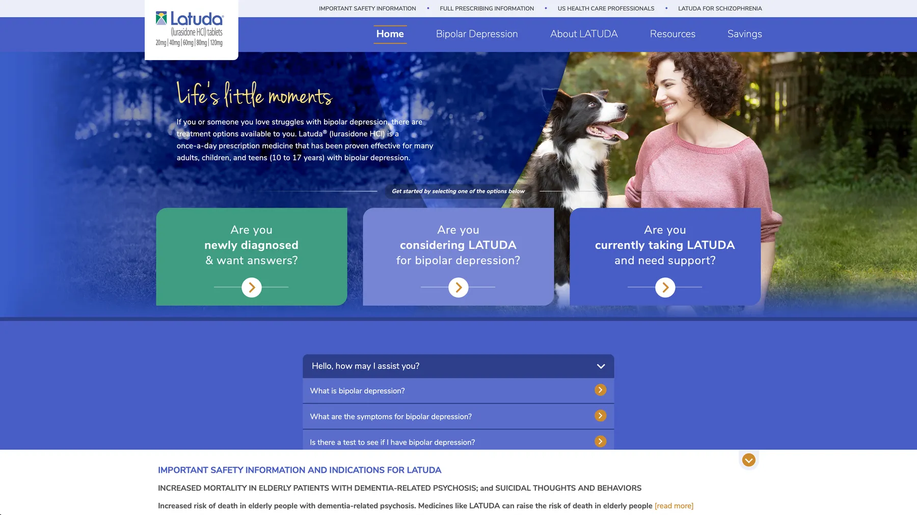
A patient-first redesign of Latuda.com that segmented visitors into three pathways and used progressive disclosure to surface the right information faster, with almost no new content.

My role
I was the veteran Senior Art Director on this brand and played a key role in the overall visual design of the site. The goal was to build a more modern and simplified experience, allowing users to self-segment to find specific content modules faster. We were given existing print campaign materials, and had to audit and determine how they could be used digitally to establish consistent visual styles.
The problem
Latuda was scheduled to go off patent, but ended up with an extension. This unexpected news meant that we would have the opportunity for a clean slate rather than be limited to just periodic content updates. We started by doing a full content audit and brainstorming how we could tell more of a patient-focused story and how we could apply new thinking to the user experience.
The audience
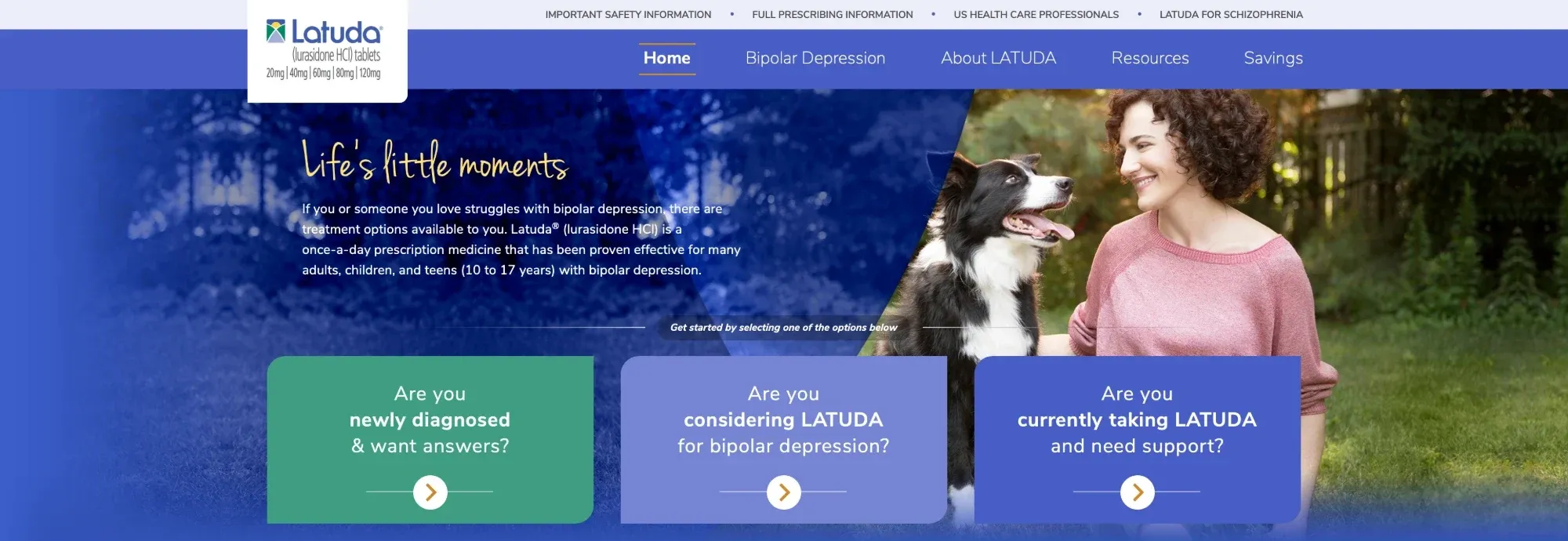
Latuda is a bipolar depression drug also indicated for schizophrenia. Research tells us that consumers usually fall into one of three audience segments: undiagnosed patients, diagnosed patients, and patients or caregivers that need support.
The solution
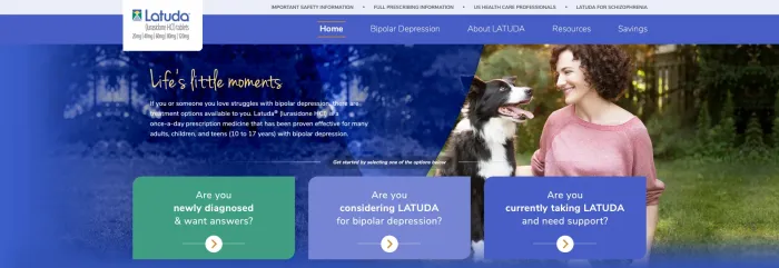
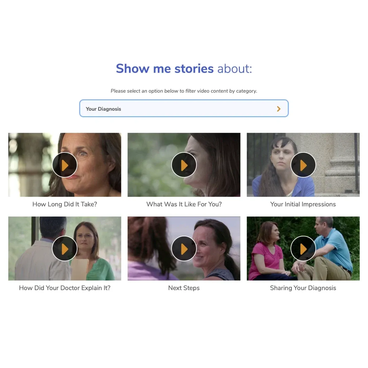
A full site overhaul that put the people first. We were able to focus on leveraging existing patient testimonial stories and segment visitors into three pathways: those who were not yet diagnosed, those currently on Latuda, and people who needed specific support materials. Because of these three user flows, we were able to use progressive disclosure to only offer consumers the information they needed at that particular time in their journeys rather than hit them with the whole kitchen sink at one time and overwhelm them, which is a mistake that a lot of pharmaceutical brands will often make.
At a glance
- 3 distinct pathways visitors see only what they need
- Testimonial videos give users relatable patient stories
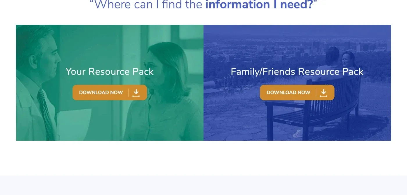
- Resource downloads to aid patients and caregivers
The impact
This site launched in November 2019 and our clients were extremely happy with it. At the time we didn't get a lot of insight into hard data, but given that the previous version of the site had almost no discernible hierarchy, the structural changes and interactive content could have only helped the audience. As with many pharmaceutical brands, this drug has reached the end of it's life cycle and the site is no longer live.
Project features
-
Audience segmentation -
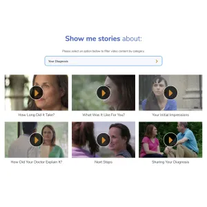
Patient video libraries -
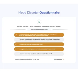
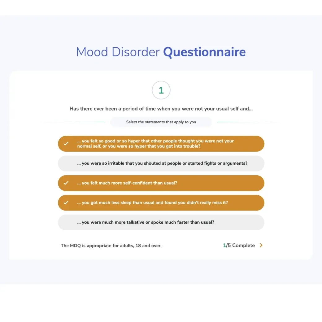
Interactive questionnaires -
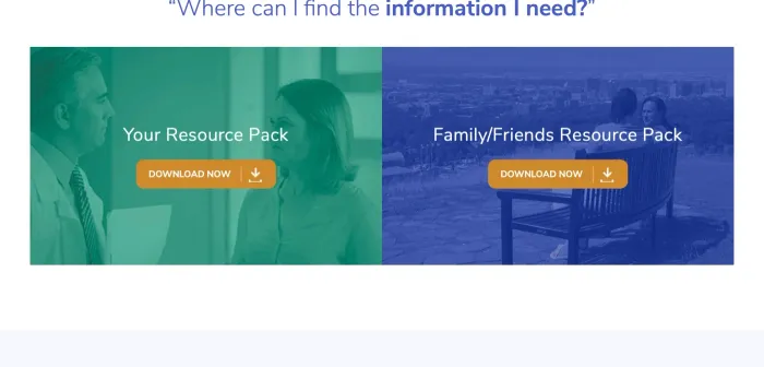
Streamlined resources -
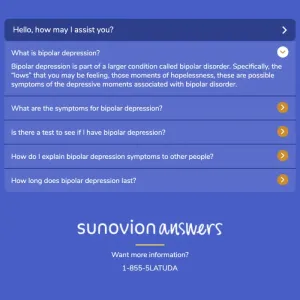
Adaptive FAQ -
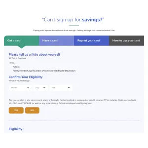
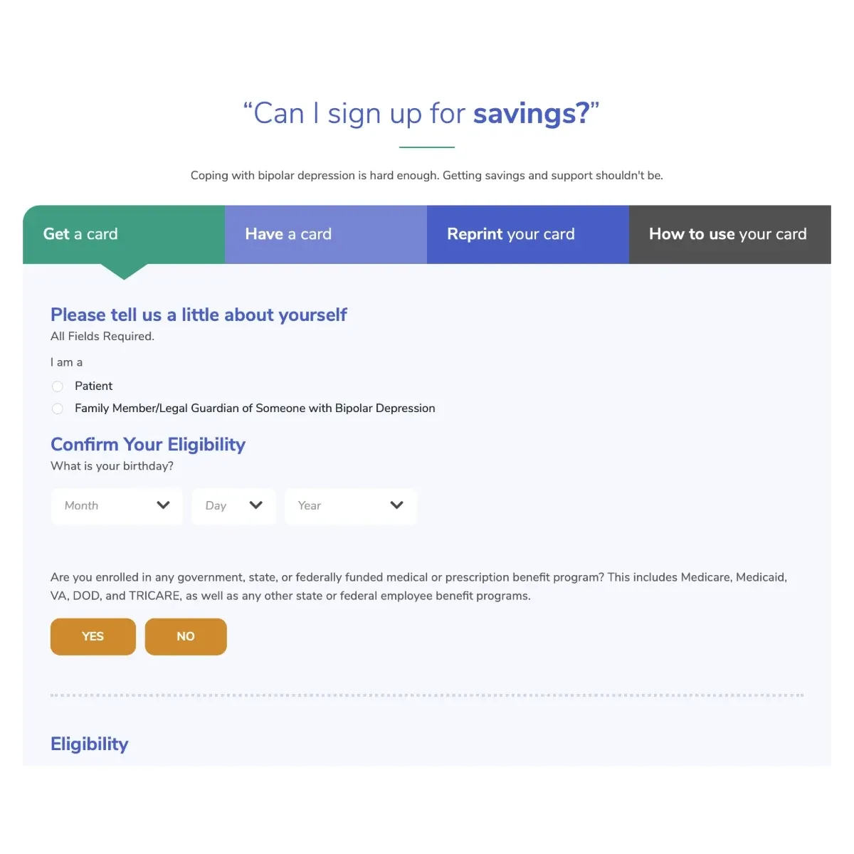
Savings sign-up
Lessons learned
I was involved in a lot for this brand spread out through my time at MRM, but this was the most significant shift that I'd seen. There are so many sites out there where brands just bombard people with data, TV commercials, stats, messaging, etc. and it really does little more than confuse people and leave them unable to find what they need. This had a much more patient-centric, story telling approach that went a long way in reframing the existing content. It was a complete visual overhaul and a bold strategy change.