
Comcast Business Front Door
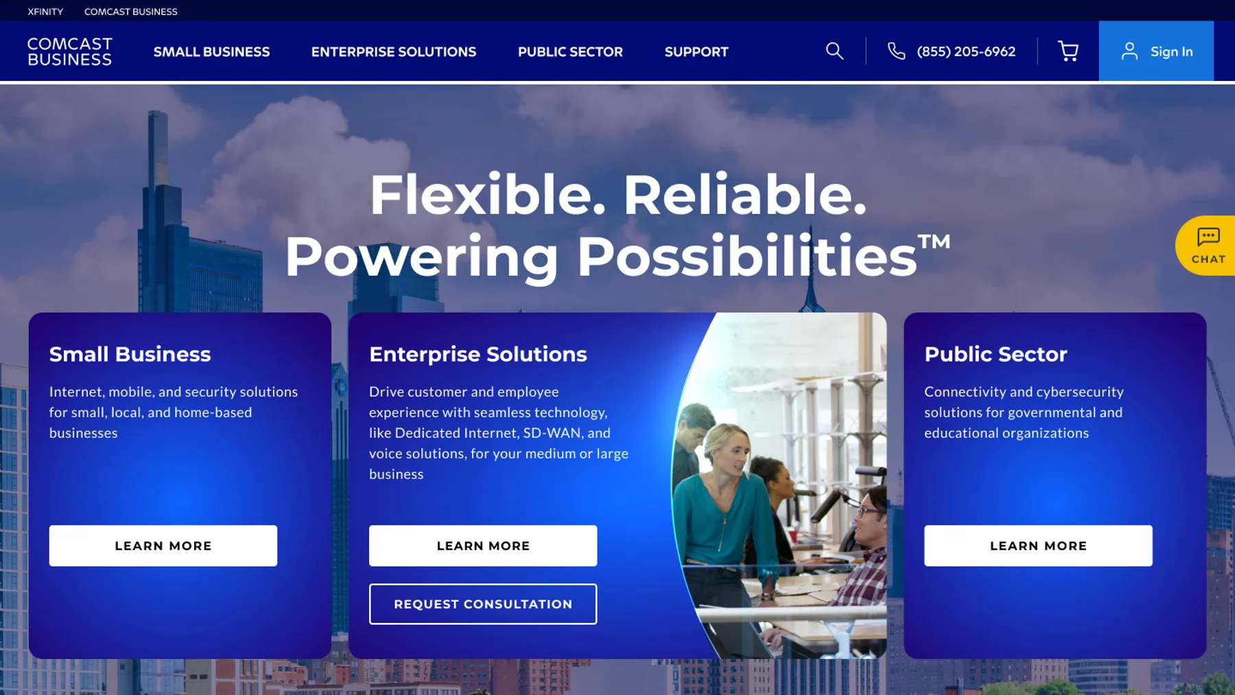
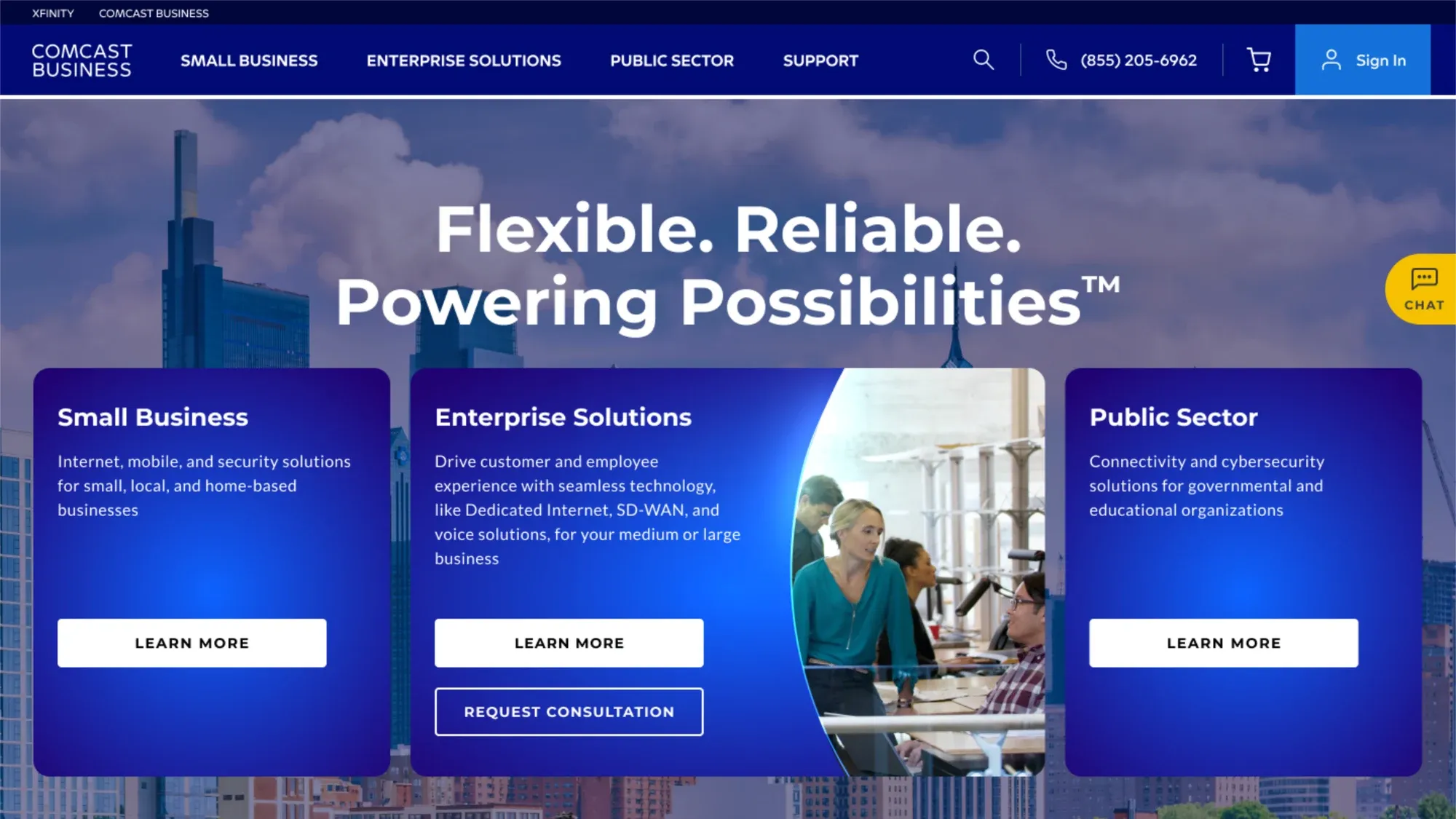
A redesigned entry point for the Comcast Business homepage that focused on reaching Small Business, Enterprise, and Public Sector customer bases.

My role
For this project, I was asked to explore different ways that we could segment the audience into our three target groups, while maintaining elements that user testing told us were important to people. The previous strategy had been to focus on small business customers and price points for internet deals, which only serves a fraction of the audience Comcast Business has solutions for.
The opportunity
My team at Comcast Business was looking for ways to reach a wider range of customers. While we had previously used the homepage as a promotional tool for small businesses in need of internet, we wanted to reach Enterprise and Public Sector groups as well. A balanced approach was important for us to show customers of all types that we had the solutions they were looking for.
The solution
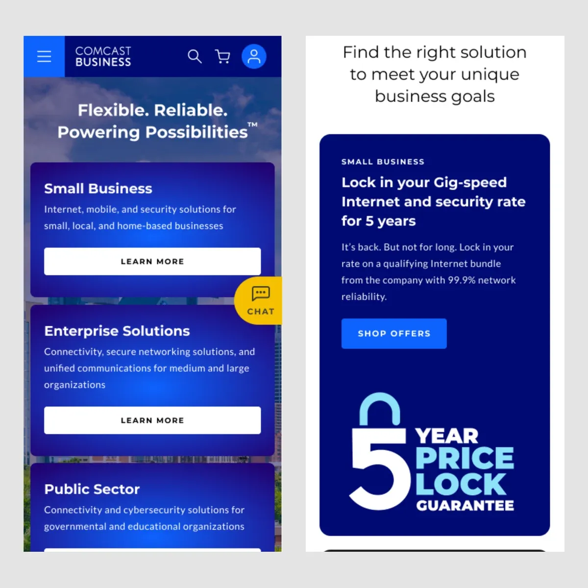
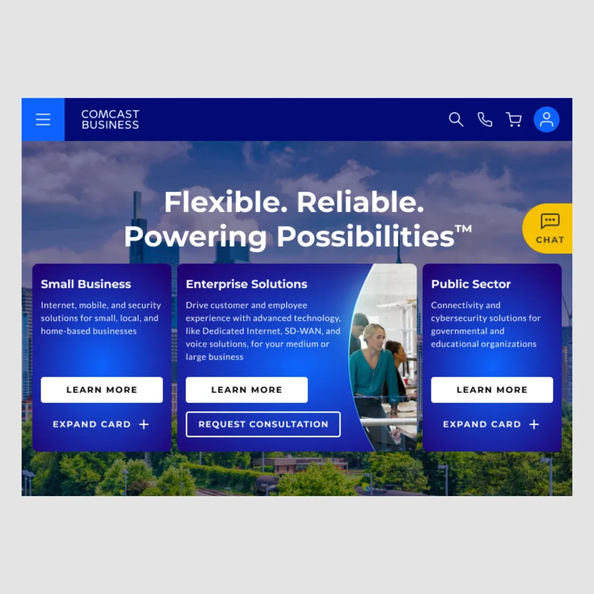
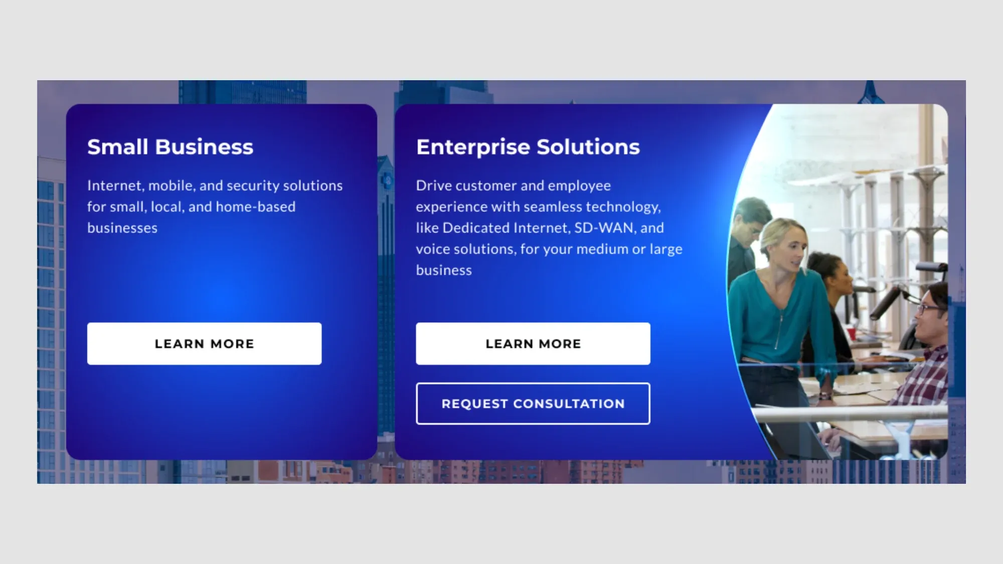
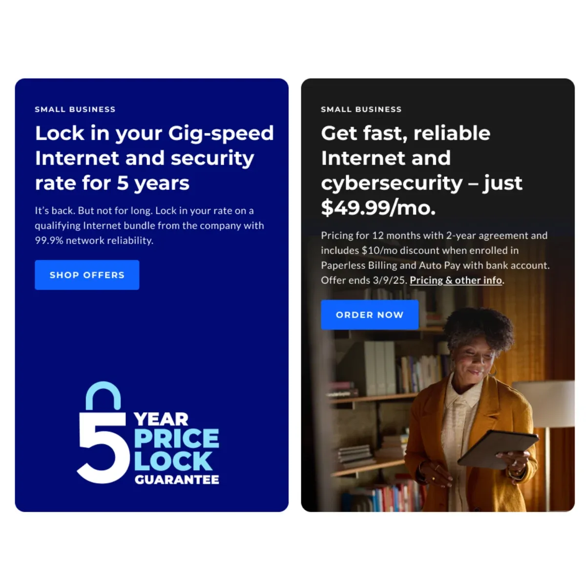
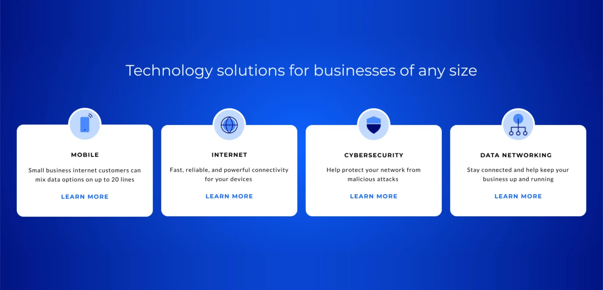
I built the front door as a way for people to self-identify based on their needs, and enticed them to learn more with animated transitions between 3 cards with different messaging. Further down the page, utilized offer cards to showcase deals and price points, as well as a 4 up feature focusing on solution buckets. Finally, the page also included a lead generation form at the bottom, for anyone who wanted to cut to the chase and speak with representatives. The ultimate goal being, increasing the speed to relevant content for users.
The impact
After rolling out the new experience through 2024, we started to see results.
- 6.3% enterprise engaged traffic-to-lead rate, up from 4% the year before
- 130% year-over-year increase in enterprise leads per month
Project features
-
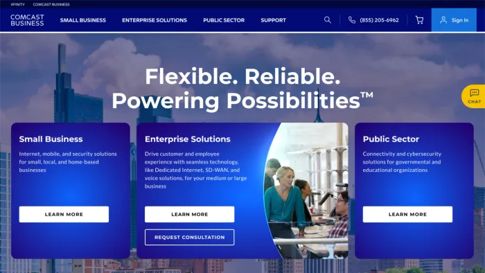
Expanding cards with audience segment messaging -
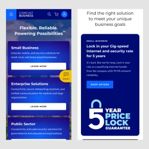
Mobile: stacked static segment and offer cards -
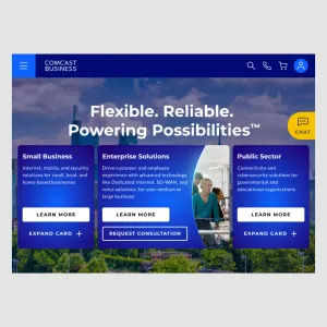
Tablet: tap to expand cards -
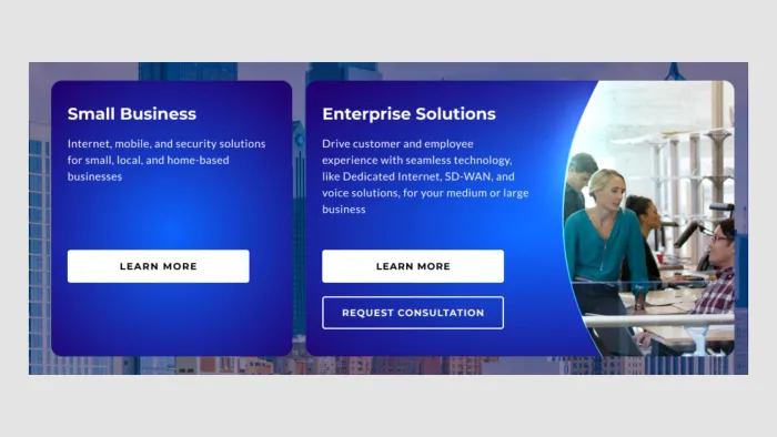
Consistent secondary CTA driving to lead form in expanded states -
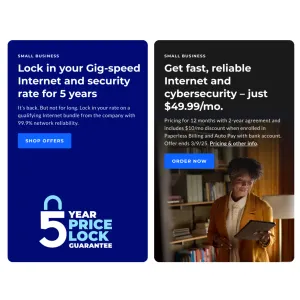
Offer spotlight cards -
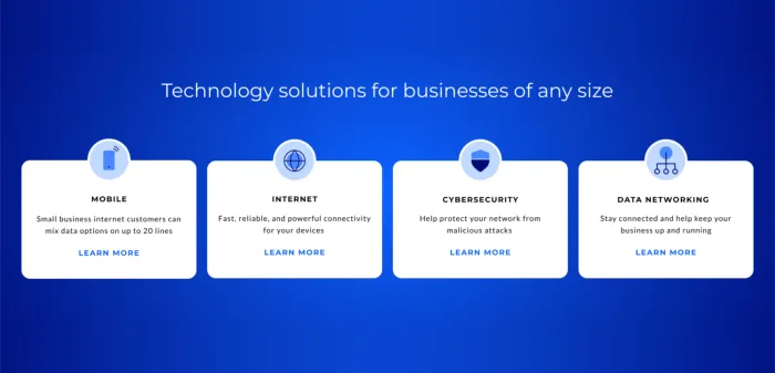
Broader solutions tiles driving to learn experience
Lessons learned
I felt particularly good about this project, because I was excited to build some animated components and work on such a high-profile area of the site. It got a lot of attention, including winning an award for redesign. That being said, there are a few things I would have changed. Initially, I proposed some different behavior for the animation. First, was a click/tap to expand rather than a roll over, due to accessibility concerns. Second, was hiding the imagery on Tablet sizes due to the incredibly tight screen real estate. Ultimately, these didn't happen due to a variation in laptop screen sizes for some of our executives. Lesson learned, and now that we know this, the whole team designs for a specific break point to accommodate this. Overall though, this was incredible exposure and very successful, so very happy I got to work on this one.